

Examining the historical highs of Nasdaq’s market capitalization relative to M2 money supply and GDP, and what it signals for investors.
79+ Sources
- Key Insights into Nasdaq’s Extreme Valuations
- The Nasdaq’s Market Capitalization and the M2 Money Supply
- Nasdaq’s Market Cap Relative to U.S. GDP
- Historical Context and Dot-Com Bubble Comparisons
- The “How Much Further Can It Go?” Question
- Summary of Valuation Comparisons
- Understanding Market Dynamics: A Mindmap
- Frequently Asked Questions
- Conclusion
- Recommended Further Reading
- Referenced Search Results
Key Insights into Nasdaq’s Extreme Valuations
- Record-Breaking Ratios: The Nasdaq’s market capitalization to M2 money supply ratio has reached an unprecedented 176%, significantly surpassing the Dot-Com Bubble’s peak, indicating a substantial divergence between equity valuations and liquid money supply.
- Buffett Indicator Redux: Similarly, the Nasdaq’s market cap to U.S. GDP ratio has hit a record 129%, nearly double its Dot-Com era high, signaling potential overvaluation when viewed through the lens of economic output.
- Drivers and Risks: While current market strength is fueled by profitable tech giants and AI narratives, these extreme valuations, reminiscent of past bubbles, suggest heightened risks and the possibility of lower long-term returns, despite the absence of a clear “ceiling.”
The financial landscape is currently witnessing a remarkable phenomenon: the Nasdaq’s market capitalization has reached extraordinary levels when compared to critical economic indicators like the M2 money supply and the Gross Domestic Product (GDP). This situation has drawn significant attention from financial analysts and investors alike, prompting a deep dive into what these record-breaking ratios imply for the future of the stock market.
The Nasdaq’s Market Capitalization and the M2 Money Supply
The M2 money supply is a broad measure of the amount of money in circulation within an economy, encompassing cash, checking deposits, savings accounts, and other highly liquid assets. When the market capitalization of a stock exchange, such as the Nasdaq, is compared to the M2 money supply, it provides insight into how much of the available liquidity is flowing into and being represented by equity valuations.
A Historic Peak in Valuation
Recent data indicates that the Nasdaq’s market capitalization relative to the U.S. M2 money supply has reached an unprecedented 176%. This figure means that the total market value of companies listed on the Nasdaq is approximately 1.76 times greater than the entire stock of liquid money in the U.S. economy. This ratio not only marks a new historical high but also significantly surpasses the previous peak observed during the Dot-Com Bubble in 2000, which was around 130-131%. The current level is roughly 45 percentage points higher than that historical peak.
The U.S. M2 money supply has seen fluctuations, with estimates placing it around $22.02 trillion to $22.12 trillion as of mid-2025. While the M2 money supply has itself been growing (with a year-over-year growth rate of around 4-5% in mid-2025 after a period of contraction), the Nasdaq’s market cap has grown at an even more accelerated pace, leading to this widening disparity.
Understanding the Implications
A high market cap to M2 ratio suggests that stock prices have outpaced the growth of the underlying money supply, potentially indicating an overvalued market. This can imply that a large portion of available liquidity is being channeled into equities, particularly into the technology and growth-oriented companies that dominate the Nasdaq. Such a situation can be viewed as a “valuation thermometer,” signaling that the market is running “hot.” While it doesn’t predict an imminent crash, it does suggest an elevated risk environment, where prices may be increasingly supported by speculation and momentum rather than fundamental economic growth or an expansion of the broader money supply.
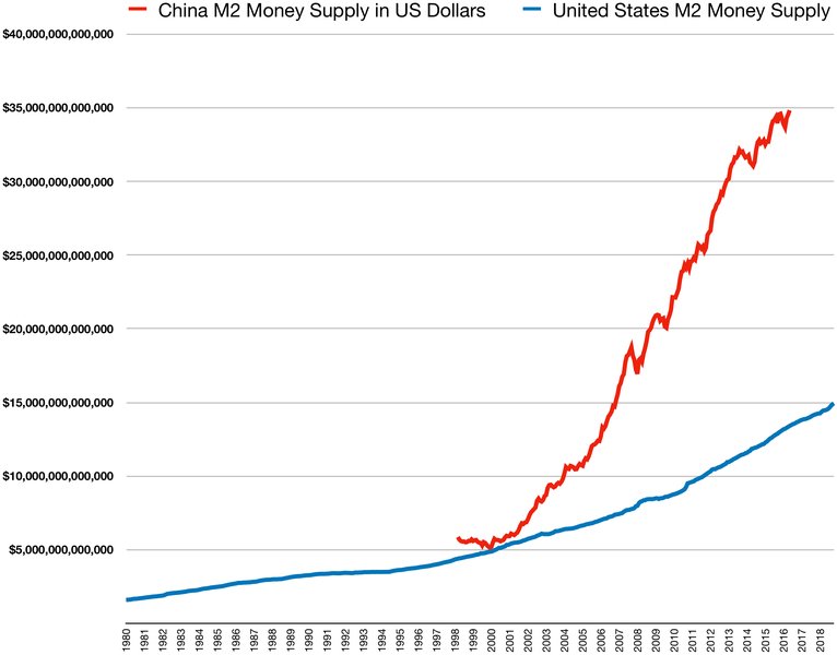
Comparative M2 Money Supply Trends: A visual representation of M2 money supply over time, highlighting the context for market capitalization comparisons.
Nasdaq’s Market Cap Relative to U.S. GDP
The market capitalization-to-GDP ratio, often referred to as the “Buffett Indicator,” is a long-term valuation metric that gauges the total value of the stock market against the overall economic output of a country. It serves as a broad measure of whether the stock market is overvalued or undervalued relative to the size of the economy it represents.
Surpassing Historical Benchmarks
The Nasdaq’s market capitalization relative to U.S. GDP has also reached an unprecedented level of 129%. This figure is nearly double the peak observed during the Dot-Com Bubble, when the Nasdaq/GDP ratio was approximately 65%. For the total U.S. stock market (including Nasdaq), the broader Buffett Indicator has been reported in the range of 213-217% in mid-2025, which is well above historical averages and even surpasses the levels seen in 2000.
Historically, a market cap to GDP ratio significantly above 100% is often considered a sign of overvaluation, implying that the stock market has grown disproportionately large compared to the real economy. Warren Buffett famously suggested that a ratio above 100% indicates an expensive market that is likely to deliver lower long-term returns.
Interpreting Economic Disconnects
This soaring ratio suggests a significant disconnect between financial asset valuations and the underlying economic activity. While corporate profits and technological advancements, particularly in AI, are contributing factors to this growth, the magnitude of the divergence raises questions about the sustainability of current market levels. It highlights a scenario where the wealth effect generated by rising stock prices is substantial, but its direct correlation to the fundamental growth of the national economy is becoming increasingly stretched.
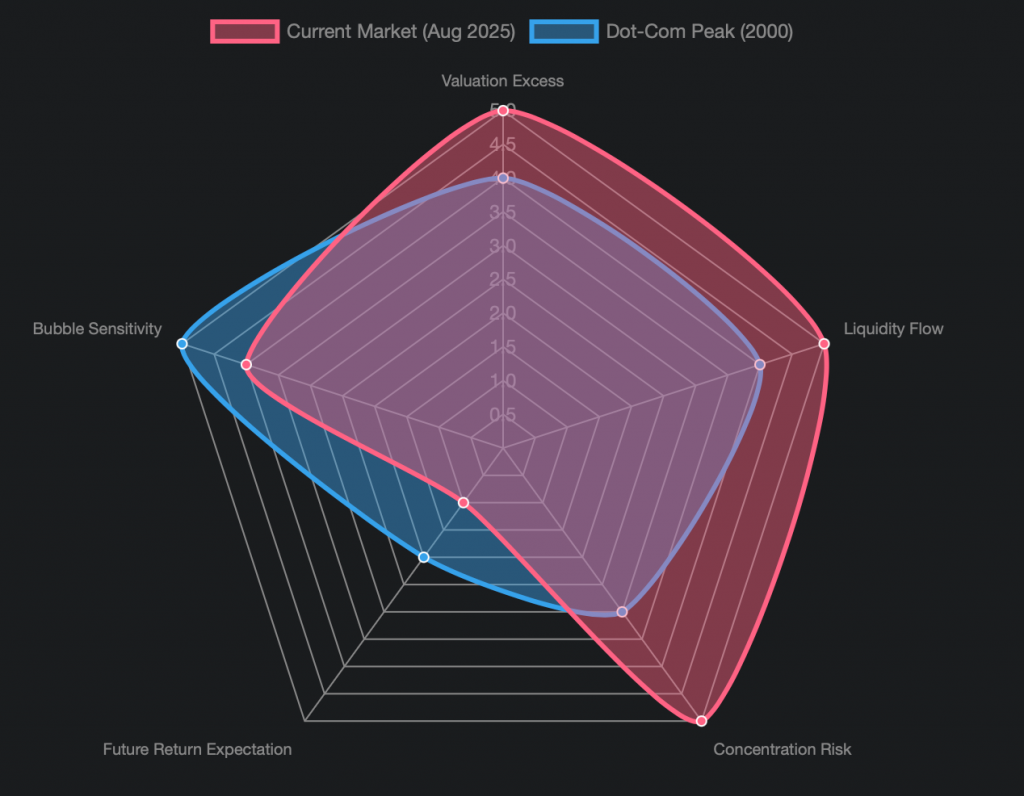
This radar chart visually compares the current market conditions in August 2025 with the Dot-Com Bubble peak in 2000 across several key dimensions. It highlights that while both periods showed significant “Valuation Excess” and “Liquidity Flow” into equities, the current market demonstrates a higher degree of “Concentration Risk” due to the dominance of a few mega-cap tech stocks. Consequently, “Future Return Expectation” appears lower for the current market due to already stretched valuations, and while “Bubble Sensitivity” was high in 2000, the current environment also exhibits significant fragility.
Historical Context and Dot-Com Bubble Comparisons
The current market environment, particularly concerning the Nasdaq, inevitably draws comparisons to the Dot-Com Bubble of the late 1990s and early 2000s. While there are striking similarities, important differences also exist.
Similarities with the Dot-Com Era
Several parallels can be drawn between today’s market and the Dot-Com Bubble. Both periods are characterized by:
- Concentration of Gains: A significant portion of market gains is concentrated in a few large-cap technology companies. During the Dot-Com era, it was internet-related stocks; today, it’s driven by AI and mega-cap tech giants.
- Elevated Valuation Multiples: Valuations, particularly on a price-to-earnings (P/E) basis, are above long-term historical norms.
- Powerful Narrative: A compelling technological narrative (the internet in 2000, AI today) drives investor enthusiasm, capital expenditure, and optimistic earnings expectations.
- Record Market-Cap Ratios: Both periods saw market capitalization to M2 and GDP ratios reach extreme, unprecedented levels.
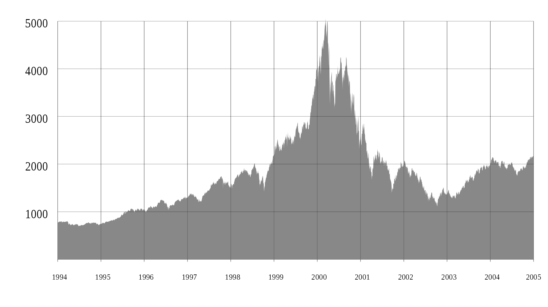
Nasdaq Composite during the Dot-Com Bubble: Illustrates the steep rise and subsequent fall of the Nasdaq Composite leading up to and after the Dot-Com peak.
Key Differences in Today’s Market
Despite the similarities, there are crucial distinctions that differentiate the current environment from the Dot-Com Bubble:
- Profitability and Cash Flows: Many of today’s leading technology companies are highly profitable with substantial free cash flows, unlike many Dot-Com companies that were often pre-profit or operating with speculative business models.
- Stronger Balance Sheets: The balance sheets of current market leaders are generally more robust, providing a greater buffer against economic downturns.
- Real Revenue Generation: The demand for AI and other advanced technologies is translating into concrete revenues and earnings, rather than purely speculative future promises.
- P/E Ratio Context: While elevated, the S&P 500 and Nasdaq P/E ratios (e.g., S&P 500 at ~22x, Nasdaq at ~28.5x forward earnings in mid-2025) are generally lower than the extreme multiples seen during the Dot-Com peak, where Nasdaq’s forward P/E could exceed 70x or even 80x.
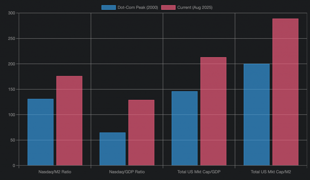
This bar chart provides a direct comparison of key valuation ratios between the Dot-Com peak in 2000 and the current market in August 2025. It clearly illustrates that the Nasdaq’s market cap relative to M2 money supply and GDP are at significantly higher levels today than during the previous bubble. Similarly, the broader U.S. market capitalization ratios also indicate elevated valuations, emphasizing the extended nature of the current market rally.
The “How Much Further Can It Go?” Question
The question of how much further these elevated ratios can extend is complex and speculative. Historically, markets can remain at “overvalued” levels for extended periods, and there is no reliable mechanical ceiling derived from M2 or GDP ratios that dictates an imminent reversal.
Factors Supporting Continued Extension
Several factors could potentially sustain or even further extend these high valuations:
- Strong Earnings Growth: Continued robust earnings surprises, especially from mega-cap tech companies driven by AI infrastructure, software monetization, and semiconductor demand, could justify higher valuations.
- Supportive Monetary Policy: If interest rates stabilize or decline, and liquidity conditions remain favorable, it could provide a tailwind for equity valuations.
- Continued Index Concentration: If investment flows continue to be funneled into a narrow group of dominant companies, their market caps could continue to swell, further impacting these ratios.
- Foreign Capital Inflows: Global capital seeking growth opportunities may continue to flow into U.S. equities, especially the leading tech names.
Potential Risks and Compression Factors
Conversely, several risks could lead to a compression of these ratios, implying a market correction or slower growth:
- Earnings Disappointments: Any significant miss in earnings expectations from the leading tech companies, particularly concerning AI-driven growth.
- Higher-for-Longer Rates or Inflation Resurgence: A shift in monetary policy towards higher rates or persistent inflation could make equity valuations less attractive.
- Regulatory or Geopolitical Shocks: Increased antitrust scrutiny of mega-caps or broader geopolitical instability could introduce market volatility.
- Broadening Market Leadership: If market leadership shifts from mega-cap tech to a wider range of smaller or value-oriented companies, it could lead to multiple compression for the current leaders.
This video discusses “200% Market Cap-to-GDP — 3 Warning Signs for U.S. Stocks,” providing further context on how a high market cap-to-GDP ratio, like the ones observed for Nasdaq, can signal potential overvaluation and risk in the broader market.
Ultimately, these ratios serve as “valuation thermometers” rather than precise timing tools. They indicate that the market, particularly the Nasdaq, is operating at extreme valuation levels, suggesting that future returns may be lower than historical averages and that volatility could be higher. Investors are advised to balance their exposure, consider diversification beyond the most crowded names, and have a plan for potential drawdowns.
Summary of Valuation Comparisons
To summarize the core valuation differences between the Dot-Com peak and the current market, the following table provides a concise overview of key indicators.
| Valuation Metric | Dot-Com Peak (Approx. 2000) | Current Market (Approx. Aug 2025) | Implication |
|---|---|---|---|
| Nasdaq Market Cap / M2 Money Supply | ~131% | ~176% (Record High) | Signifies greater equity valuation relative to liquid money supply. |
| Nasdaq Market Cap / U.S. GDP | ~65% | ~129% (Record High) | Indicates increased equity valuation relative to economic output. |
| Total US Market Cap / U.S. GDP (Buffett Indicator) | ~146% | ~213-217% (Elevated) | Broader market also shows significant overvaluation. |
| Total US Market Cap / M2 Money Supply | ~200% | ~289% (Nearing Dot-Com Highs) | Overall market liquidity channeled into equities at high levels. |
| Nasdaq Forward P/E Ratio | >70x – 80x | ~28.5x (Elevated but Lower) | Current P/E ratios, while high, are generally less extreme than 2000. |
| Profitability of Leading Tech Companies | Often Low/Negative | High Profitability & Cash Flows | Fundamental strength distinguishes current leaders. |
This table highlights that while current P/E valuations are less extreme than during the Dot-Com Bubble, the relative market capitalization metrics (compared to M2 and GDP) are at or beyond previous peaks, indicating a new dimension of market extension.
Understanding Market Dynamics: A Mindmap
The interplay of various factors contributing to these extreme market valuations can be complex. This mindmap illustrates the key drivers, comparisons, and potential implications for the market’s trajectory.
mindmap
root[“Nasdaq Valuation Extremes”]
Current_Ratios[“Current Record Ratios”]
Nasdaq_M2[“Nasdaq Market Cap / M2: 176%”]
Nasdaq_GDP[“Nasdaq Market Cap / GDP: 129%”]
Total_MktCap_GDP[“Total US Mkt Cap / GDP: 213-217%”]
Historical_Context[“Historical Context: Dot-Com Bubble (2000)”]
Nasdaq_M2_2000[“Nasdaq Market Cap / M2: ~131%”]
Nasdaq_GDP_2000[“Nasdaq Market Cap / GDP: ~65%”]
Total_MktCap_GDP_2000[“Total US Mkt Cap / GDP: ~146%”]
Similarities[“Similarities to Dot-Com”]
Concentrated_Gains[“Concentrated Gains in Tech”]
Elevated_Multiples[“Elevated Valuation Multiples”]
Powerful_Narrative[“Powerful Narrative: AI Boom”]
Differences[“Key Differences Today”]
Profitable_Leaders[“Highly Profitable Tech Leaders”]
Strong_BalanceSheets[“Stronger Balance Sheets”]
Real_Revenue[“AI Translating to Real Revenue”]
Lower_PE[“Lower Forward P/Es vs. 2000 Peak”]
Implications[“Implications for Investors”]
Valuation_Thermometer[“Valuation Thermometer, Not Timing Tool”]
Higher_Volatility[“Expect Higher Volatility”]
Lower_LongTerm_Returns[“Lower Long-Term Returns Anticipated”]
Diversification[“Importance of Diversification”]
How_Further[“How Much Further Can It Go?”]
Sustaining_Factors[“Factors Sustaining Highs”]
Earnings_Surprises[“Strong Earnings Surprises (AI)”]
Supportive_Policy[“Supportive Monetary Policy”]
Index_Concentration[“Continued Index Concentration”]
Compression_Risks[“Risks for Compression”]
Earnings_Disappointment[“Earnings Disappointments”]
Higher_Rates[“Higher-for-Longer Rates”]
Regulatory_Shocks[“Regulatory/Geopolitical Shocks”]
Leadership_Shift[“Broadening Market Leadership”]
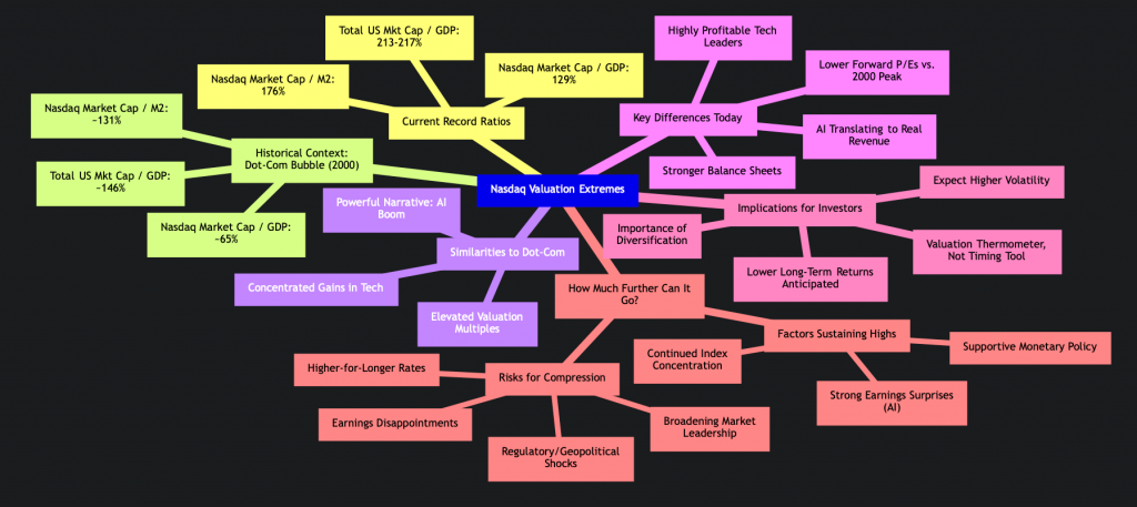
This mindmap provides a structured overview of the current Nasdaq valuation extremes. It details the record-breaking ratios, draws comparisons with the Dot-Com Bubble highlighting both similarities and key differences, and outlines the broad implications for investors. Furthermore, it explores the various factors that could either sustain or compress these high valuations, helping to contextualize the “how much further can it go?” question.
Frequently Asked Questions
What does Nasdaq’s market cap relative to M2 money supply signify?
This ratio indicates how much of the economy’s liquid money supply is reflected in the total value of Nasdaq-listed companies. A higher ratio suggests that equity valuations are growing much faster than the underlying money supply, potentially signaling an overvalued market where funds are heavily concentrated in equities.
What is the “Buffett Indicator” and what does it suggest about current market valuations?
The “Buffett Indicator” measures total stock market capitalization as a percentage of a country’s Gross Domestic Product (GDP). A high ratio, like the current 129% for Nasdaq’s market cap to U.S. GDP or over 200% for the total U.S. market, suggests that the stock market is overvalued compared to the size of the economy, implying potentially lower long-term returns.
How do current market conditions compare to the Dot-Com Bubble?
Current conditions share similarities with the Dot-Com Bubble, such as concentrated gains in tech stocks, elevated valuations, and a powerful narrative (AI). However, key differences include today’s leading tech companies being highly profitable with strong balance sheets and generating real revenues, unlike many speculative firms in 2000. Additionally, current P/E ratios, while high, are generally lower than the extreme multiples seen during the Dot-Com peak.
Do these high ratios mean a market crash is imminent?
Not necessarily. While these ratios serve as “valuation thermometers” indicating stretched valuations and heightened risk, they are not precise timing tools for predicting market reversals. Markets can remain at elevated levels for extended periods, especially if supported by strong earnings growth and favorable economic conditions. However, they do suggest increased potential for volatility and possibly lower long-term returns.
Conclusion
The Nasdaq’s market capitalization has indeed reached unprecedented heights relative to both the U.S. M2 money supply and GDP, surpassing the peaks of the Dot-Com Bubble in several key metrics. These extreme valuations indicate a significant channeling of liquidity and investor capital into the equity market, particularly into the dominant technology and AI-driven companies. While some fundamental differences exist compared to 2000, such as the current profitability of leading tech firms, the elevated ratios serve as a “valuation thermometer,” signaling a market running hot. Investors should interpret these levels as an indicator of increased risk, potential for higher volatility, and possibly lower long-term returns, emphasizing the importance of diversified portfolios and careful risk management.
Recommended Further Reading
- Explore the long-term impact of M2 money supply growth on stock market valuations.
- Delve deeper into a detailed comparison of the current tech market dynamics versus the Dot-Com Bubble.
- Discover effective investment strategies for navigating markets with high valuation ratios.
- Understand the nuances of the Buffett Indicator and its historical predictive power for market returns.
Referenced Search Results
x.com
Nasdaq Market Capitalization to M2 Money Supply Ratio Hits Record High – Econovisuals on X
gurufocus.com
Buffett Indicator: Market Cap to GDP Ratio – GuruFocus
ycharts.com
U.S. M2 Money Supply Growth Trends – YCharts
nasdaq.com
longtermtrends.net
The Buffett Indicator: Market Cap to GDP – LongtermTrends
tradingview.com
United States Money Supply M2 (ECONOMICS:USM2) – TradingView
en.macromicro.me
US – Total Market Cap Divided by M2 Money Supply – MacroMicro
reuters.com
Is today’s AI boom bigger than the dotcom bubble? – Reuters
investopedia.com
Stock Market Capitalization-to-GDP Ratio: Definition and Formula
en.wikipedia.org
fool.com
Largest Companies by Market Cap in 2025 | The Motley Fool
marketbeat.com
Financial Calendars and Market Data | MarketBeat
reddit.com
r/Infographics on Reddit: U.S. Stock Market Capitalization vs. M2 Money Supply (2000–2024/05)
voronoiapp.com
U.S. Stock Market Capitalization to M2 Money Supply Hits 289 …
macrotrends.net
Nasdaq Market Cap 2010-2025 | NDAQ | MacroTrends
streetstats.finance
US & Global M2 Money Supply – StreetStats
macrotrends.net
NASDAQ Composite – 45 Year Historical Chart
investing.com
Investing.com – Stock Market Quotes & Financial News
databank.worldbank.org
Stock market capitalization to GDP (%) – Glossary | DataBank
ih.advfn.com
NASDAQ Market Movers – Today – Regular Market | ADVFN
seeitmarket.com
NASDAQ 5000: A Look At The 2000 Market Top vs 2015
en.macromicro.me
Major Central Bank M2 Money Supply YoY % vs S&P 500 & NASDAQ 100 YoY % | UGC Charts | MacroMicro
futures.tradingcharts.com
March Nasdaq Historical Prices Charts
fool.com
How to Invest in Vanguard Small-Cap ETF (VB) | The Motley Fool
datatrack.trendforce.com
Broad Money M2 / Total Market Capitalization of Listed Companies
voronoiapp.com
U.S. Stock Market Cap-to-GDP Ratio Hits Record 213% in … – Voronoi
businessinsider.com
Stock Market Bubble: Chart Shows Overvaluation Higher Than Dot …
en.macromicro.me
US – Total Market Cap Divided by M2 Money Supply | US Stock Market | Collection | MacroMicro
ca.investing.com
Nasdaq’s Market Cap Tops US GDP, Far Exceeding Dot-Com Peak | …
en.macromicro.me
World – Stock Market Capitalization by Country (% of GDP)
nasdaq.com
The Stock Market Just Did Something It Hasn’t Done Since the Dot …
bitdegree.org
Worldcoin Price Today – WLD Coin Price Chart & Crypto Market Cap
investing.com
Nasdaq’s Market Cap Tops US GDP, Far Exceeding Dot-Com Peak | …
fred.stlouisfed.org
Real M2 Money Stock (M2REAL) | FRED | St. Louis Fed
nasdaq.com
NASDAQ Composite Index (COMP) Index: Insights, Performance, and Trends | Nasdaq
x.com
fred.stlouisfed.org
M2 (WM2NS) – Federal Reserve Economic Data | FRED
currentmarketvaluation.com
Buffett Indicator Shows Stock Market is Strongly Overvalued
investing.com
Comparing the dot-com bubble with today’s market By Investing.com
fedprimerate.com
tradingview.com
Number of employees of MongoDB, Inc. – NASDAQ:MDB – TradingView
en.macromicro.me
US – Total Market Cap (% of GDP) – MacroMicro
nasdaq.com
statista.com
NYSE and Nasdaq: market cap comparison 2024 | Statista
reuters.com
Echoes of dotcom bubble haunt AI-driven US stock market | Reuters
macrotrends.net
Dow Jones vs NASDAQ Since 1971
linkedin.com
US stock market capitalization falls to 270% of M2 money supply in …
nasdaq.com
M2 and the Markets: An Indicator of Future Inflation? | Nasdaq
fred.stlouisfed.org
S&P 500/M2 | FRED | St. Louis Fed
longtermtrends.net
Nasdaq to S&P 500 Ratio – Updated Chart
advfn.com
ADVFN | Live Stock, Options & Crypto Market Data, Trading Tools & Community
marketwatch.com
The dot-com bubble peaked 25 years ago this week. Are investors …
fred.stlouisfed.org
Stock Market Capitalization to GDP for United States (DDDM01US…
en.macromicro.me
US – M2 Money Supply [M2] (YoY) | Series – MacroMicro
voronoiapp.com
Nasdaq-U.S. Market Capitalization Hits Historic Record of 142% of …
tradingeconomics.com
United States – NASDAQ Composite Index
goldmansachs.com
The Late 1990s Dot-Com Bubble Implodes in 2000 – Goldman Sachs
tradingview.com
Markets Today — Quotes, Charts, and Events — TradingView
data.worldbank.org
Market capitalization of listed domestic companies (% of GDP) | Data
reddit.com
Is a dot com bubble kind crash possible again? : r/investing – Reddit
reddit.com
fedprimerate.com
NASDAQ Composite History Chart
ceicdata.com
US Market Capitalization: % of GDP, 1975 – 2025 | CEIC Data
en.macromicro.me
US – M1 & M2 Money Supply – MacroMicro
x.com
Econovis on X: ” NASDAQ-100 to U.S. M2 Money Supply Ratio Hits …
tradingeconomics.com
United States Money Supply M2 – Trading Economics
fred.stlouisfed.org
M2 (M2SL) | FRED | St. Louis Fed
stockstotrade.com
Dot-Com Bubble Chart and Explanation
longtermtrends.net
M2 Money Supply Growth vs. Inflation – Updated Chart
reddit.com
The Nasdaq is now worth 145% of ALL the money in America (M2 …
barrons.com
Stocks Are Pricier Than They Were in the Dot-Com Era. That Alone …
blog.syzgroup.com
Nasdaq market capitalization to US M2 Money Supply has hit a RECORD 142%.
markets.businessinsider.com
NASDAQ 100 Market capitalization | Markets Insider
gurufocus.com
Buffett Indicator: The percent of total market cap relative to GNP
marketbeat.com
My MarketBeat | Free Stock Portfolio Tracker
nasdaq.com
Median market cap Definition | Nasdaq
cnbc.com
15 years after Nasdaq peak: Look how it’s changed
en.wikipedia.org
nasdaq.com
Nasdaq-100® | The Index of Innovation for High-Growth Investments
Last updated August 31, 2025